
ABOUT
hi! i'm hazel, a 24-year-old artist from hungary.in 2024 i finished my msc program and got my masters degree in graphic design at the metropolitan university of budapest.
as an artist, my main focus is in illustration, character design and visual art. i am passionate about telling stories through colors, characters and textures, letting my experiences and the world around me influence and shape my work.


photo study / digital / july '24

"quiet evening" / digital / july '24

"brat summer" / pencil, watercolor / july '24

mock THE LONDONER cover / marker / sept '23

"stroopwafel" / pencil / august '24

"game of desire" / digital / may '24

"besties" / digital / march '24

"the spur boots" / pencil, watercolor / may '24

"goncharov 1973" / pen, pencil / dec '23

"chef lecter" / pencil, watercolor / may '22

"tasting" / collage, digital / march '24


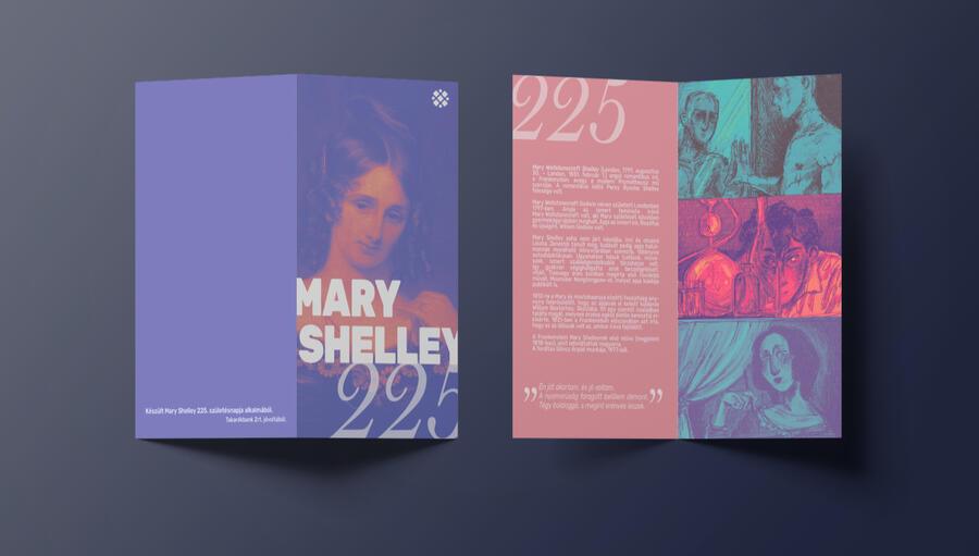
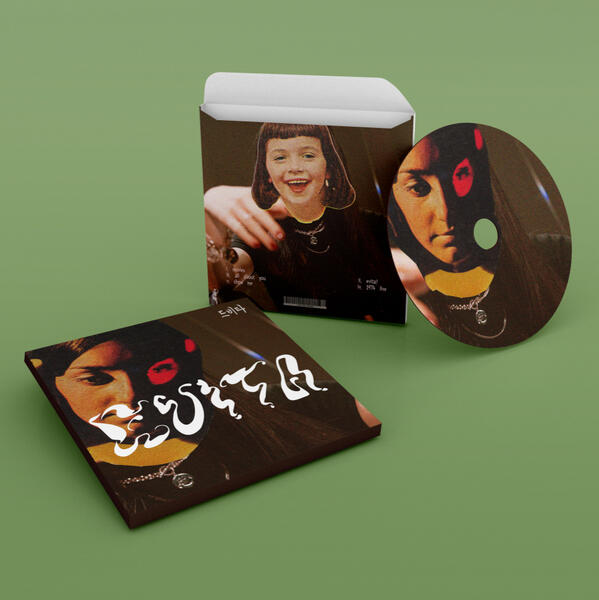
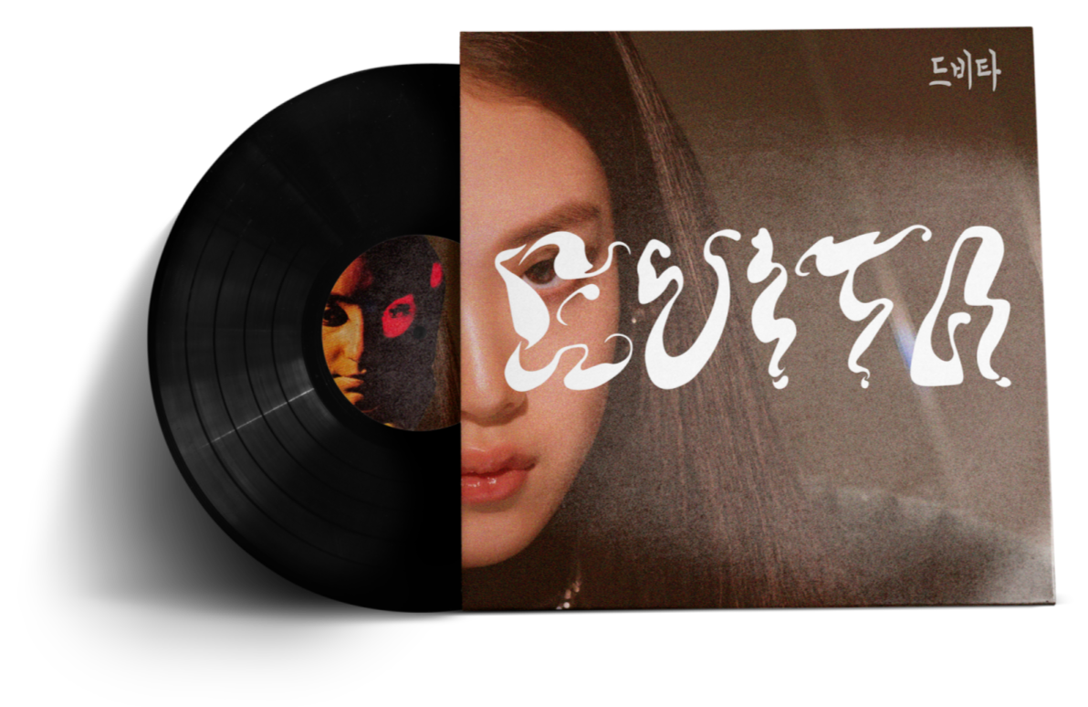
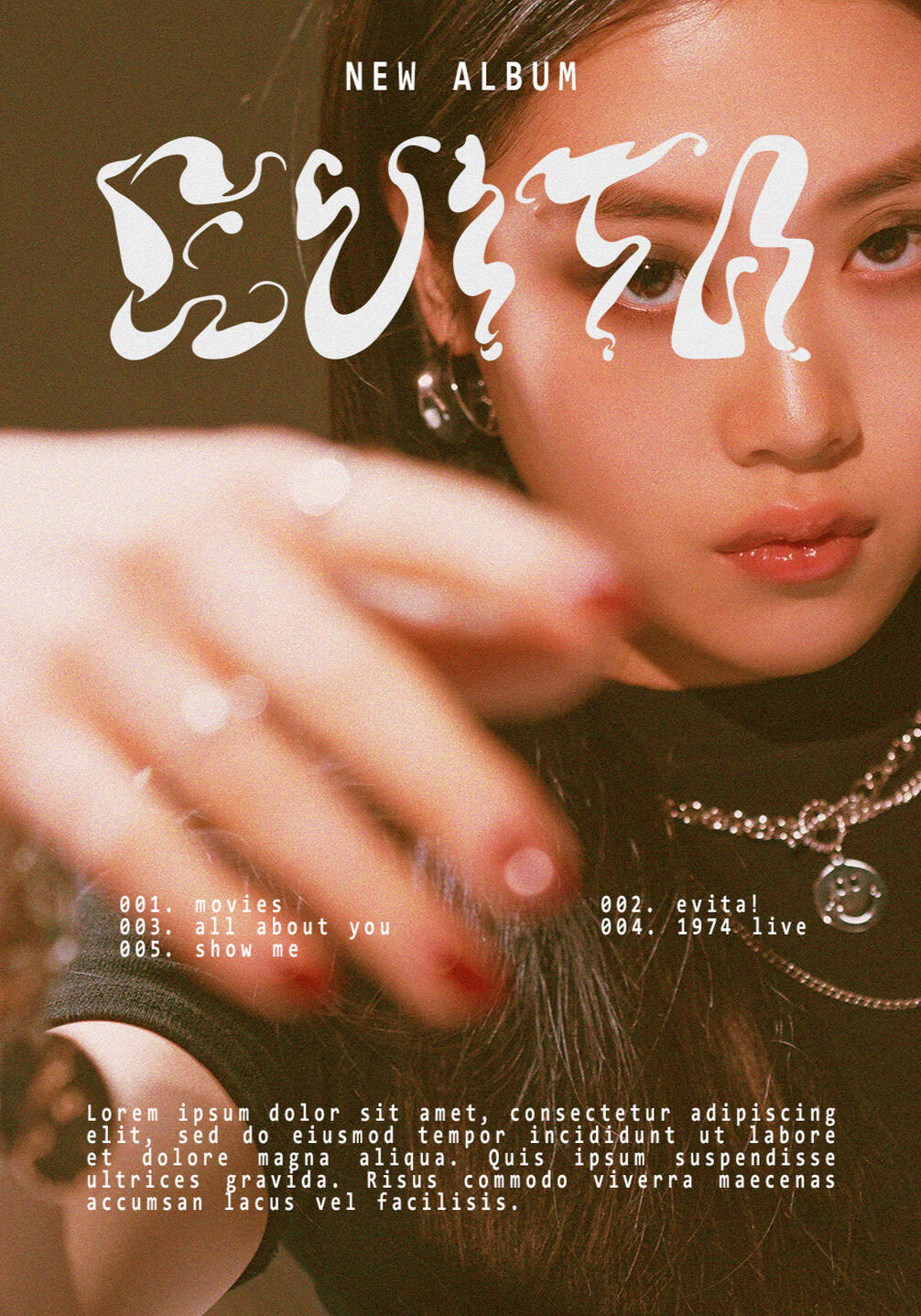
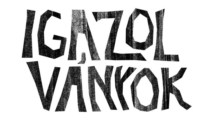
EVITA music typography project


queneau logo design & book illustrations

pocket book about graphic design

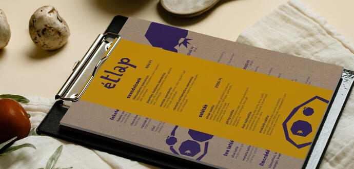
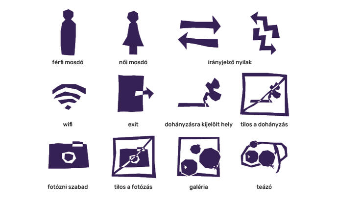
feketeribizli gallery & teahouse branding

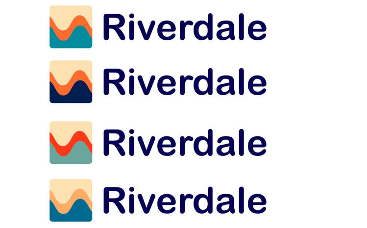
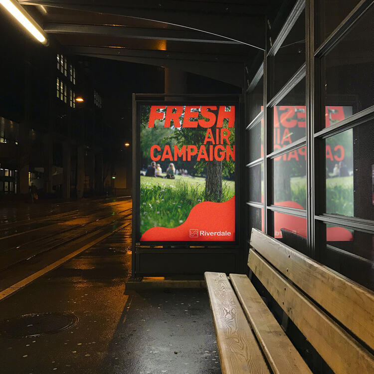
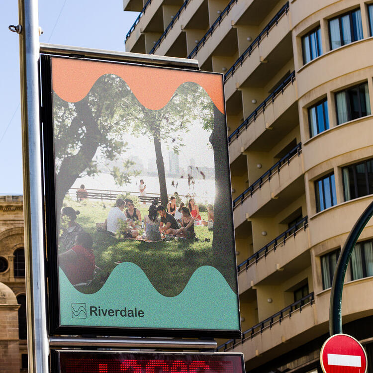
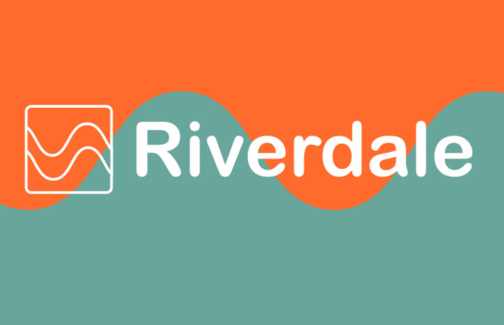
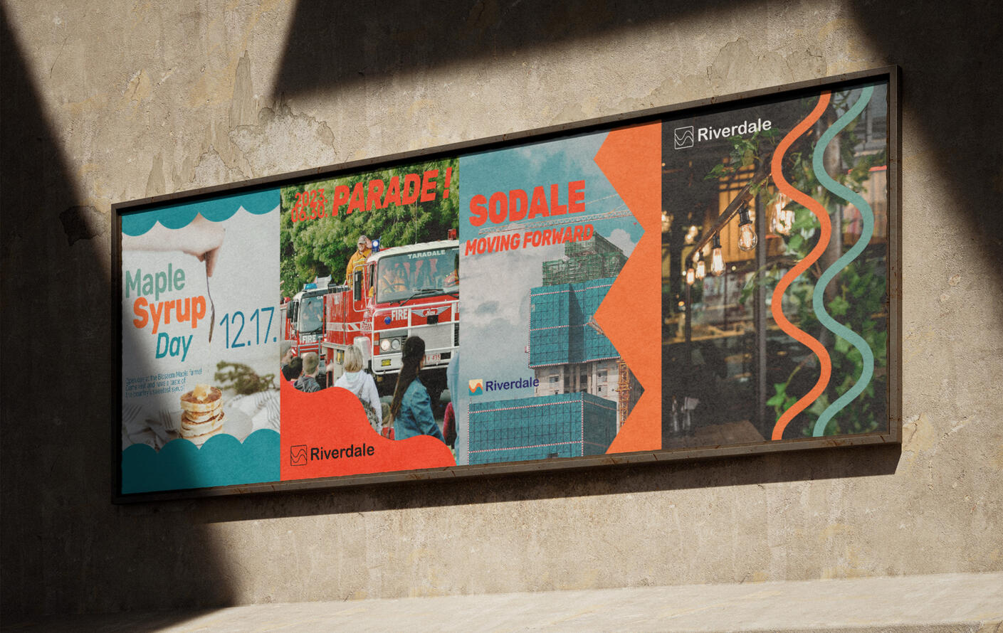
riverdale corporate identity

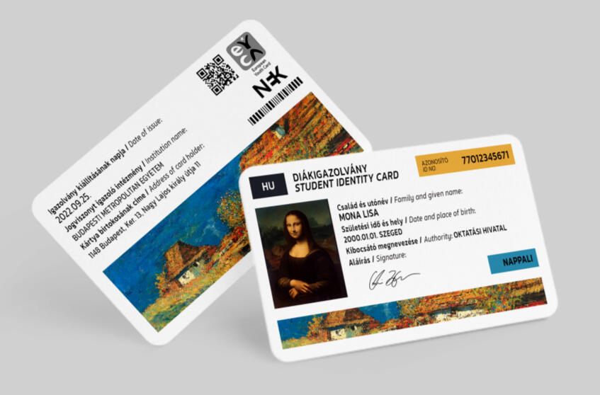
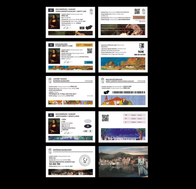
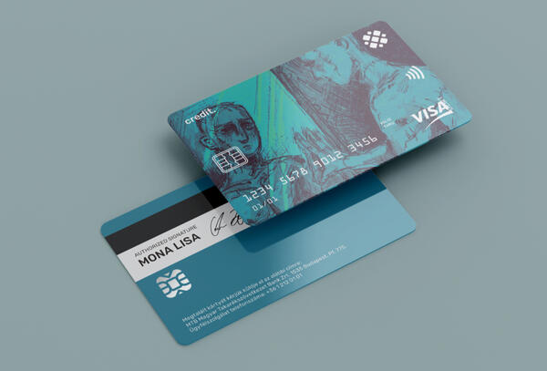
hungarian ID cards redesign project


"winner" / digital / august '24

"it's my birthday :-)" / digital / april '24

"éva" / digital / june '24

"aurel" / digital / june '24


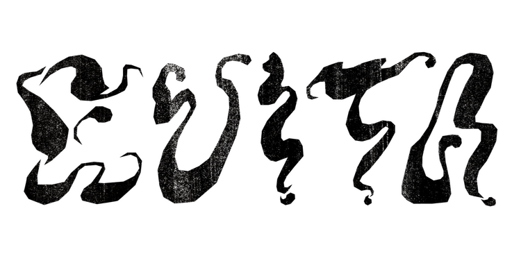
DeVita (드비타) is a south korean-american singer who debuted under AOMG in 2020 with her extended play crème.
inspired by the unique sounds and futuristic visuals of her song evita, i designed a bold display font and created cover variations around the title.


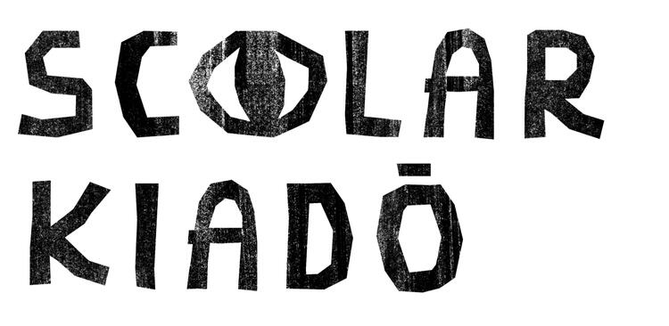
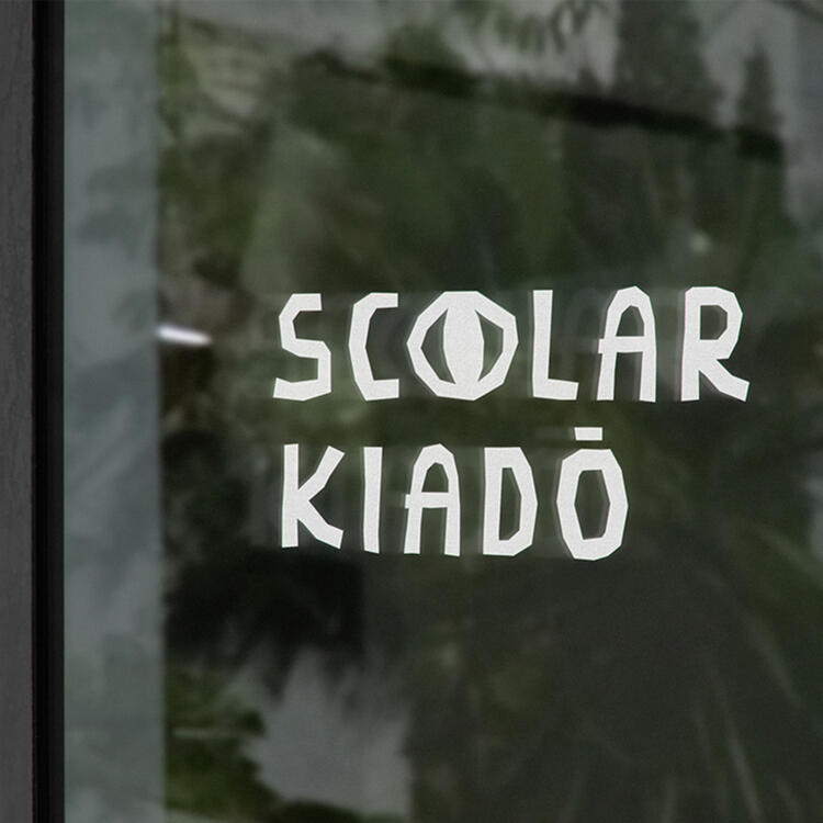
SCOLAR publishing has been operating since 1994. their mission is to preserve and pass on the love for books and appreciation for knowledge.
i wanted my logo for scolar publishing to look polished, sophisticated and inviting at the same time—to represent the values they carry.
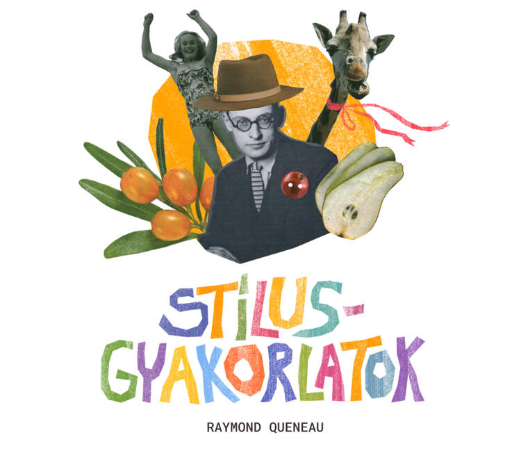
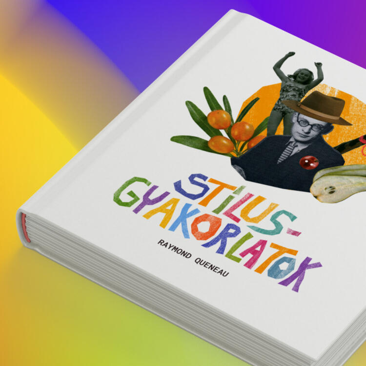
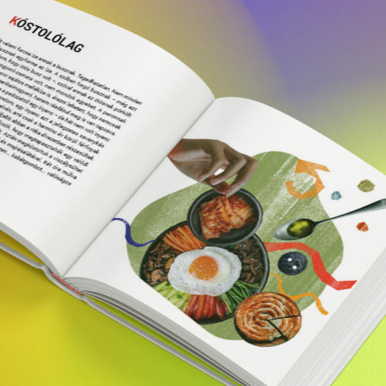
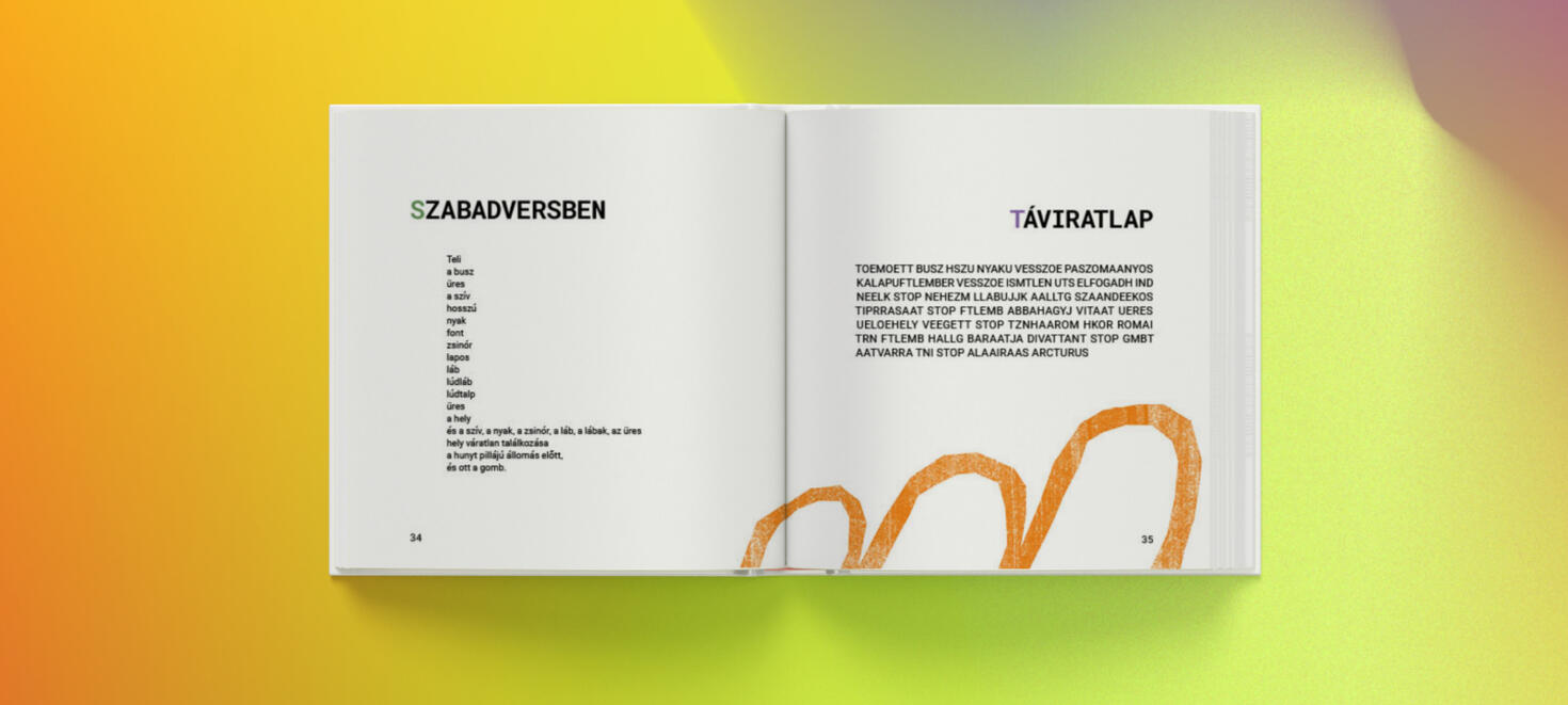
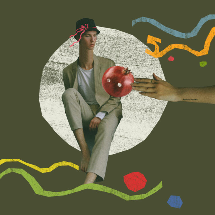
the plot of raymond queneau's exercises in style is quite simple: a man gets into an argument with another passenger on a bus. however, this anecdote is told ninety-nine more times, each in a radically different style, as a sonnet, an opera, in slang, and with many more permutations. this virtuoso set of variations is a linguistic rust-remover, and a guide to literary forms. (goodreads)
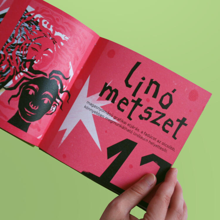
my illustrations for this book are a mix of physical and digital media. every item i used for my collages are cut out of magazines and newspapers i've collected over the years.
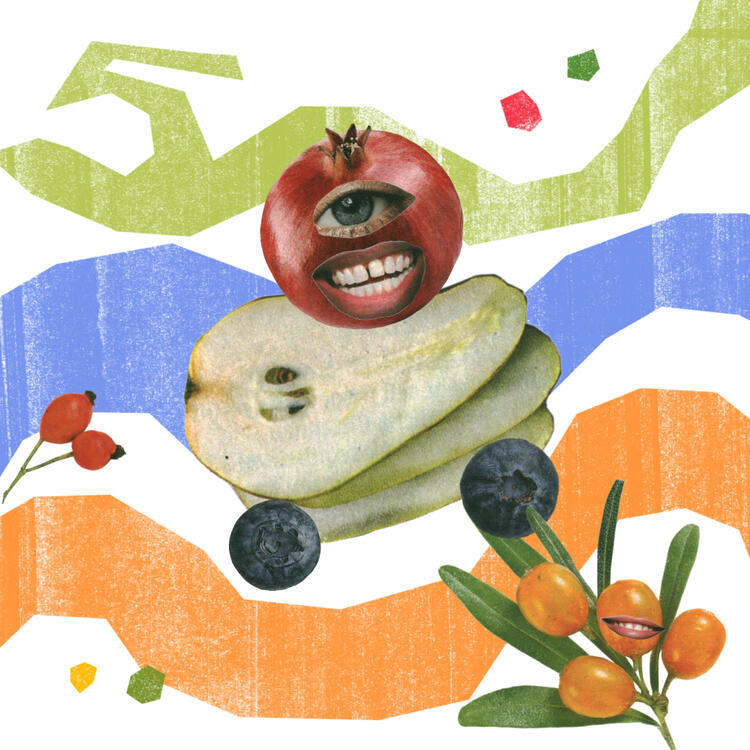


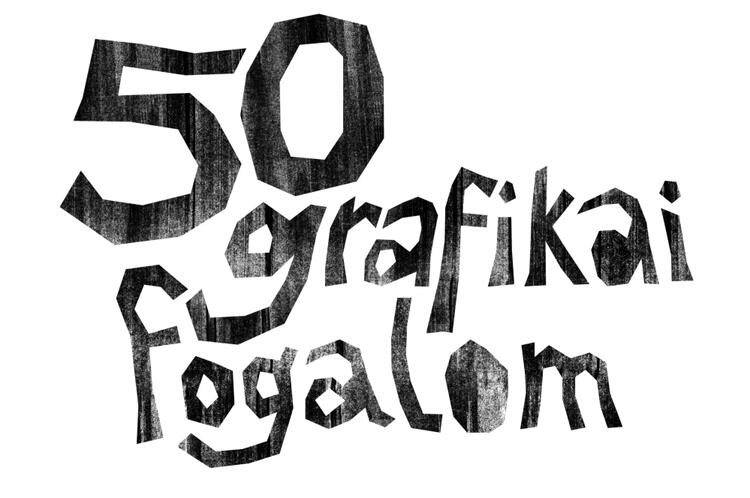
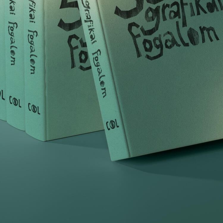
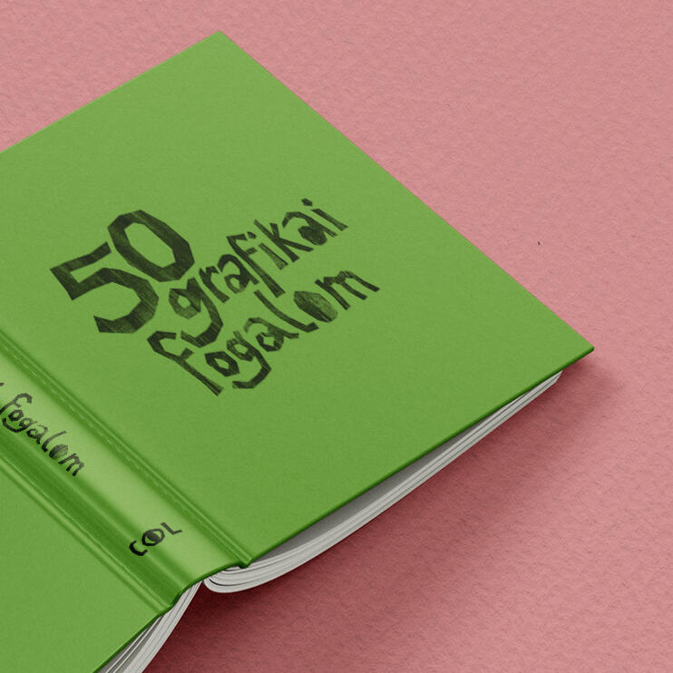
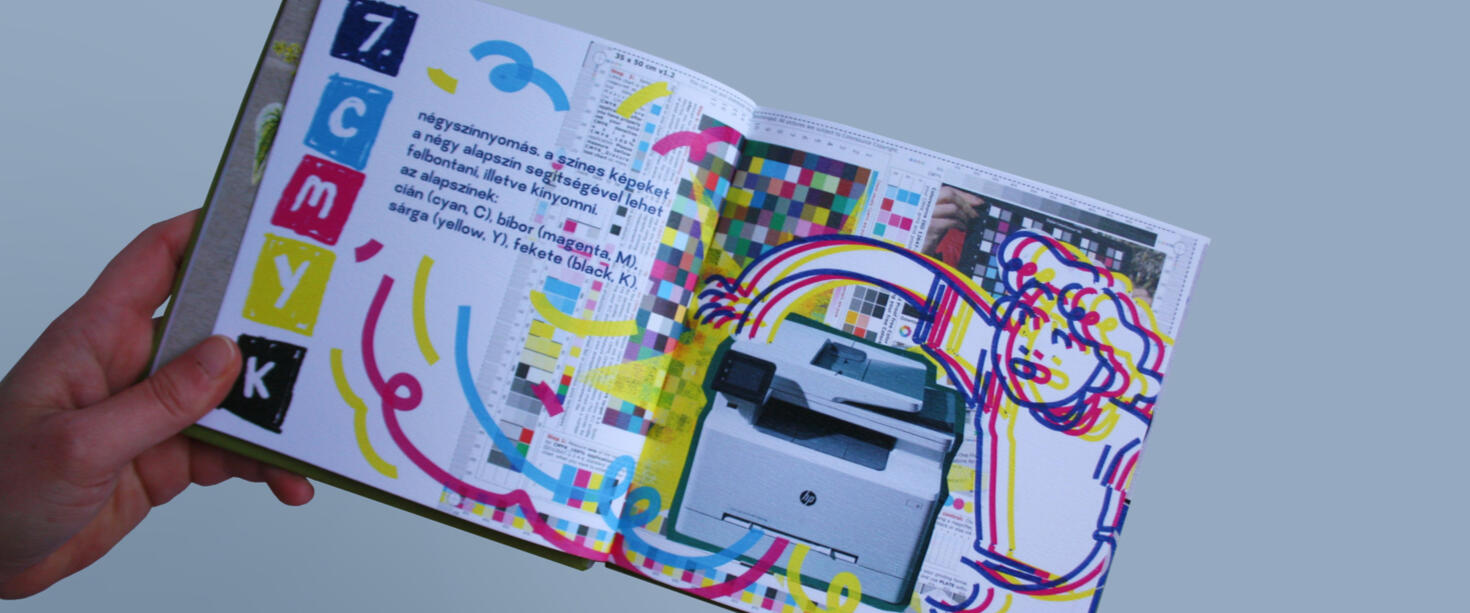
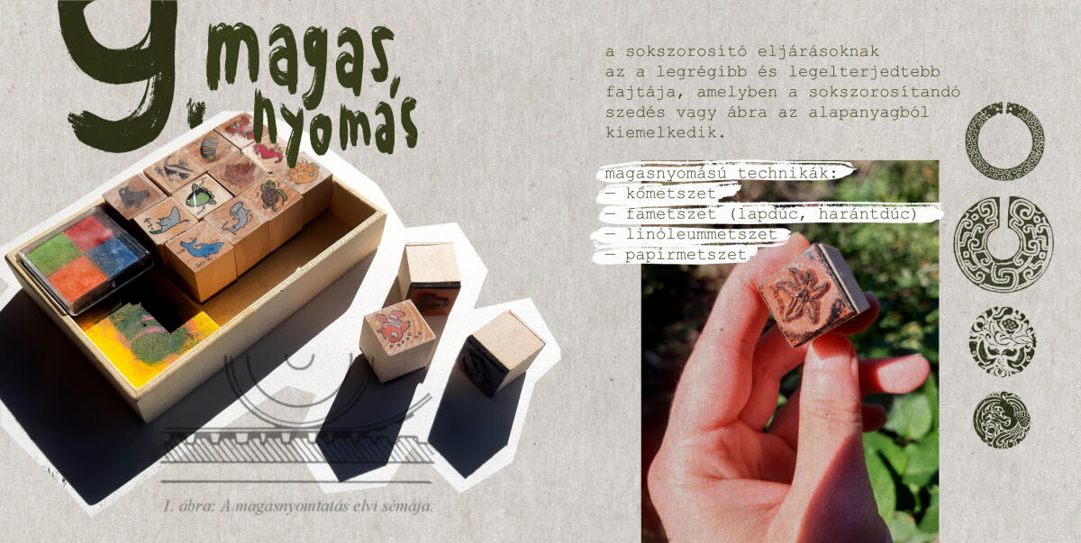
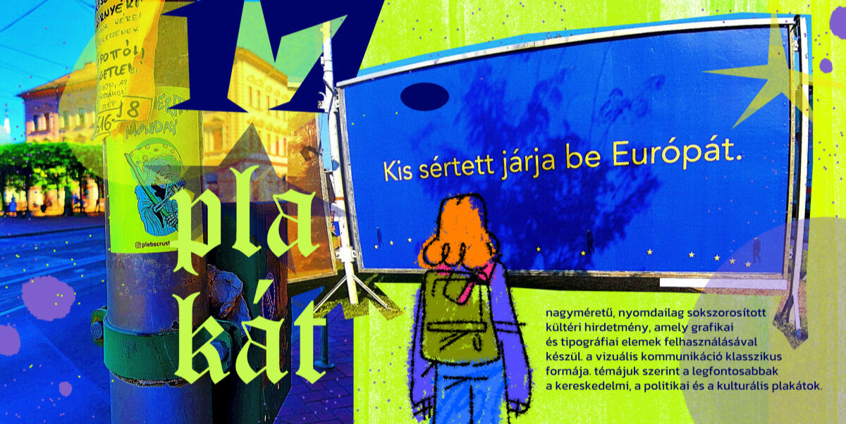
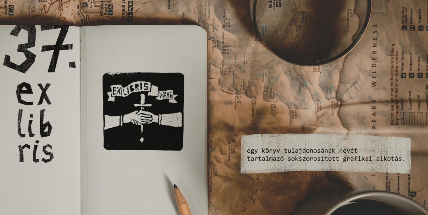
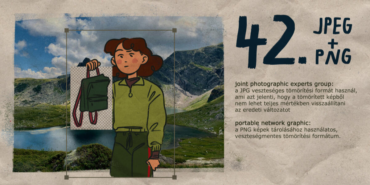
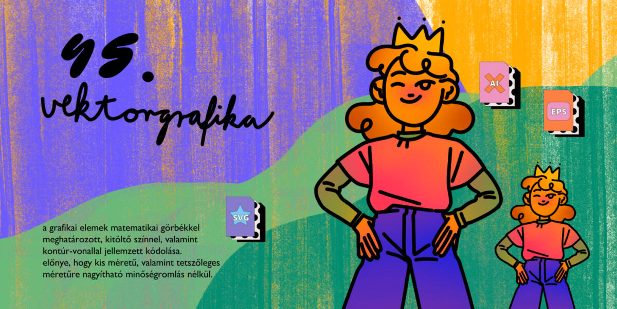
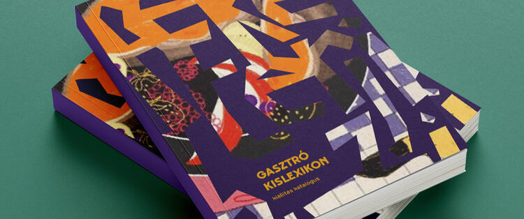
in 50 notions of graphic design, as the title supplies, i collected fifty notions and concepts centered around graphic design and presented them in a fun and easily digestible manner.
my main goal with this project was to make the in's and out's of graphic design more accessible while also expressing myself.

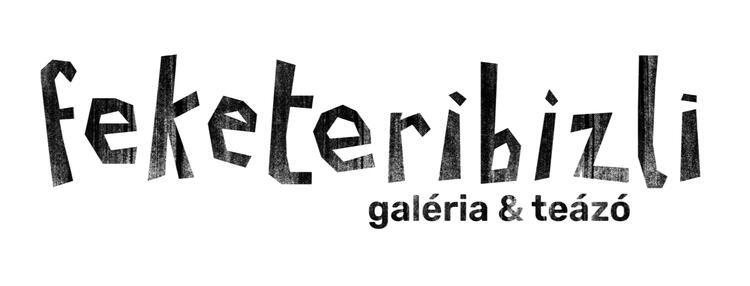
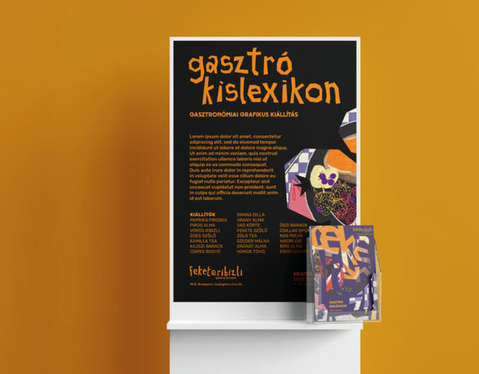
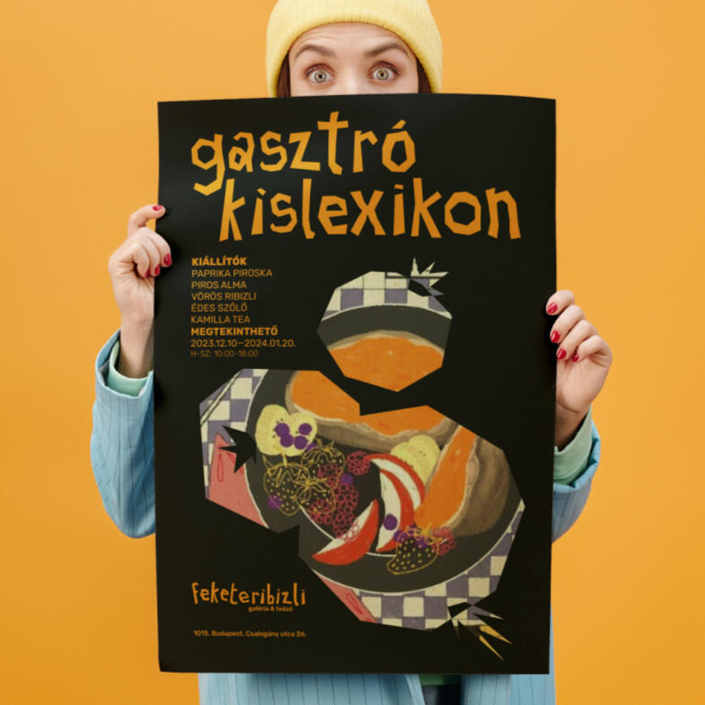
the feketeribizli brand is built around an association that collects pieces for its temporary exhibitions based on calls for tenders. the gallery focuses on unique and reproduced graphics, as well as design graphics.
the exhibitions are based around a theme or exhibit the work of a single person, giving hungarian artists the opportunity to introduce themselves.
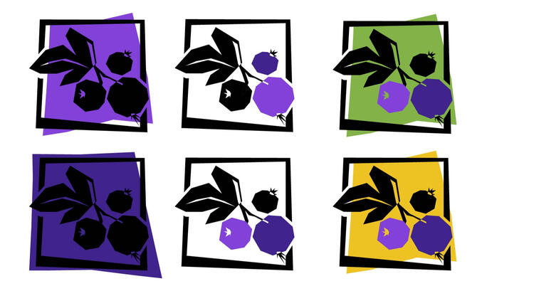
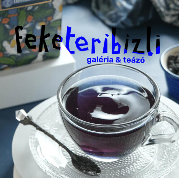
the gallery & tea house got its name after the unique and peculiar blackcurrant fruit. its color reminiscent of ink symbolizes the gallery and graphics, while the drink made from it is the symbol of the tea house.
"we want to convey the refreshing effect of blackcurrants not only through our teas, but also through the limitless possibilities of graphics, design and illustration to everyone who visits us."for this brand identity i had something fresh, yet a little bit old-school and traditional in mind.


the town of riverdale comes from the hit tv show by the same name. for this project, i wanted to revamp the town's image; keep the retro 80's kind of vibes but make cool and approachable.


text